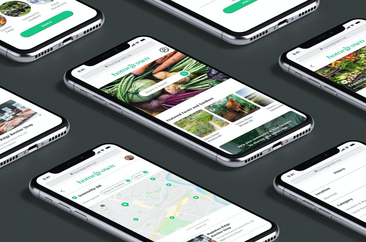
Homegrown is a location-based web app that bridges the gap between people and their food source. This is possible through rebuilding the connections that have been lost in our neighbourhoods, and fostering communities where neighbours can share knowledge, gardening space, and even food.
- Timeline: 6 week project
- Role: UX, UI Designer
- Tools: Sketch, Invision, Miro, Photoshop
Discovery
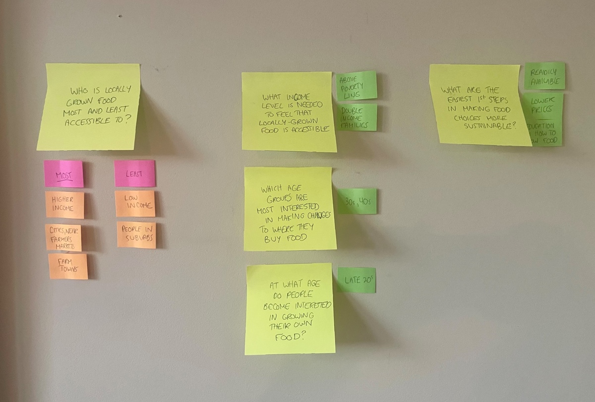
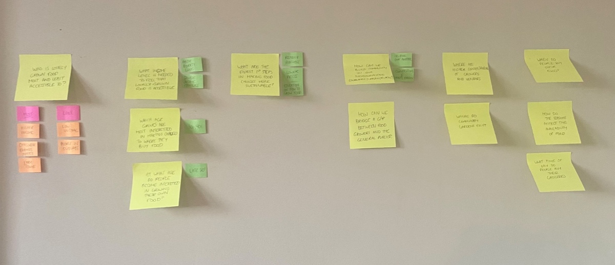
Mapping the Problem
Before diving straight into my user research, I mapped out the most important questions to consider while gathering insight through the competitor analysis and interviews.
Competitor Analysis
I wasn’t able to find any current apps that match my concept, however I conducted an analysis of food-related location apps like Yelp and Happy Cow. I studied their marketing strategies and User Interface with a focus on the methods they use to attract users and encourage them to generate thoughtful content about local businesses. I also considered areas for improvement, such as finding better ways of building trust with users.
Interviews
A series of interviews were conducted with people interested in increasing the amount of locally grown foods they buy and consume. Here are some of the most common findings:
- Geographic access is an even bigger barrier than budget. Many people live in food deserts and don’t even know where to look.
- There are almost no online tools focused on improving access to locally grown food. Most users search for markets and local farms through Google search or Facebook/Instagram.
- People feel disconnected from their neighbours and community as a whole. The pandemic has affected this isolation even further.
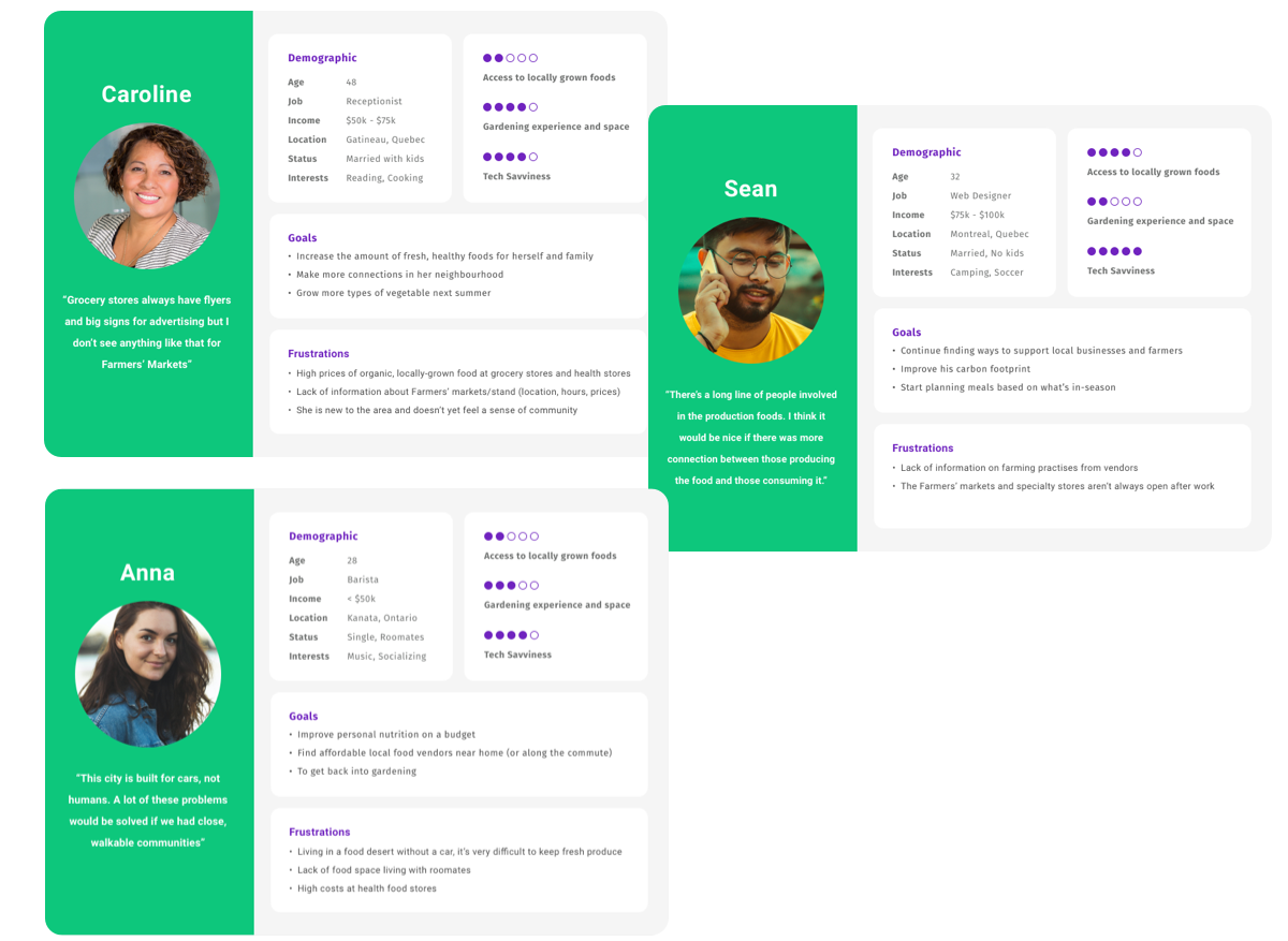
User Personas
Exploration
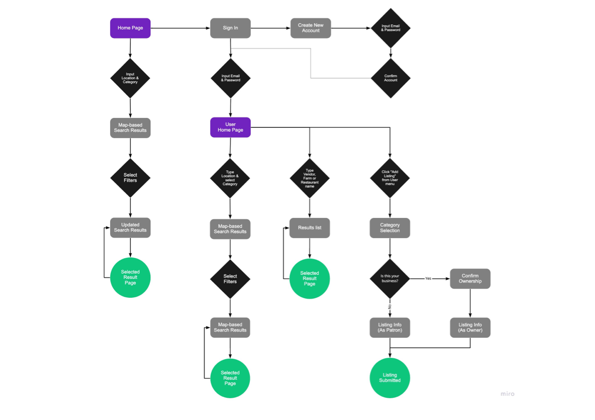
User Flow
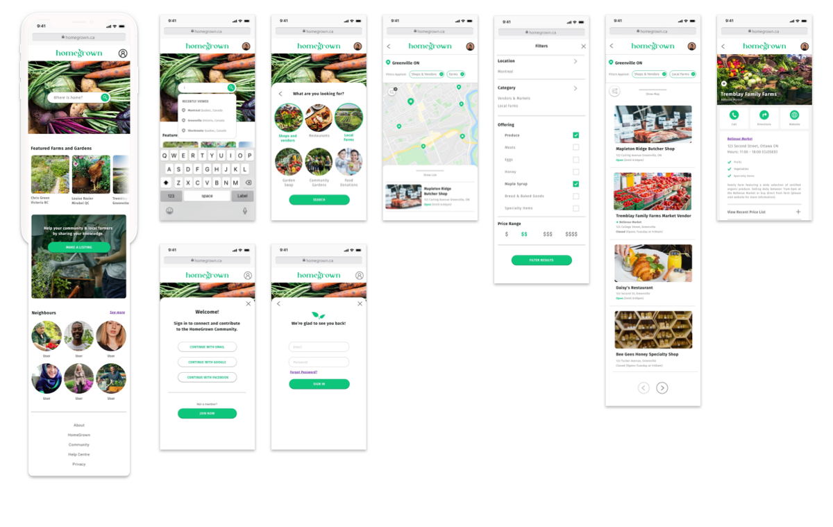
- Logging in or creating an account
- Using the location-based search function to find nearby suggestions
- Searching for a specific result by name, to find more information
- Submitting a listing as either business owner or patron
Most Viable Product
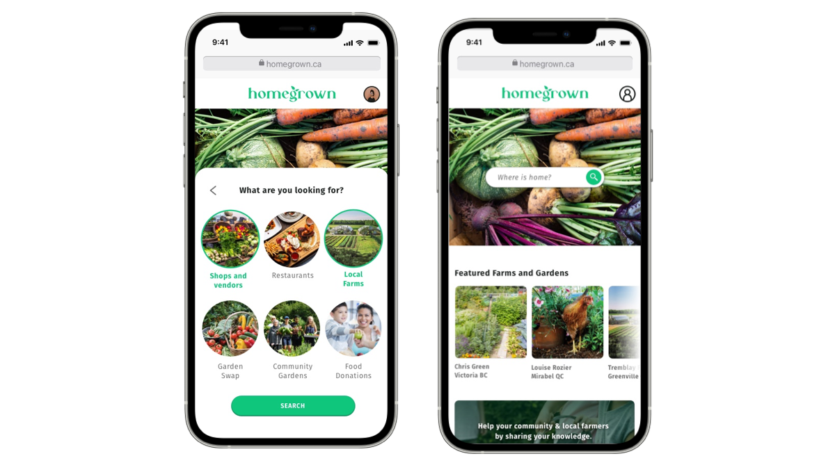
The heart of Homegrown is the search function that generates map-based results of nearby farms, markets, restaurants etc. where users can find locally grown foods. However, without the tools that address the lack of
access that certain demographics experience, the app will not succeed in its goal at improving access for everyone.
For users that lack nearby purchasing options, Homegrown will also provide alternative options like Community Gardens and Garden Swap. The Garden Swap option is an exciting tool that connects neighbours so they
can share tips about
gardening, and swap tools, seeds and extra produce.
The Food Donation category encourages listings from anyone that has extra produce from their gardens or fruit trees that may otherwise go to waste. Users in need can browse this option to see if anyone in their
neighbourhood is offering
food on the app.
It was crucial to prioritize the needs of lower-income users when designing the MVP, in order to solve hurdles that would ultimately create a more effective tool for everyone.
Prototype
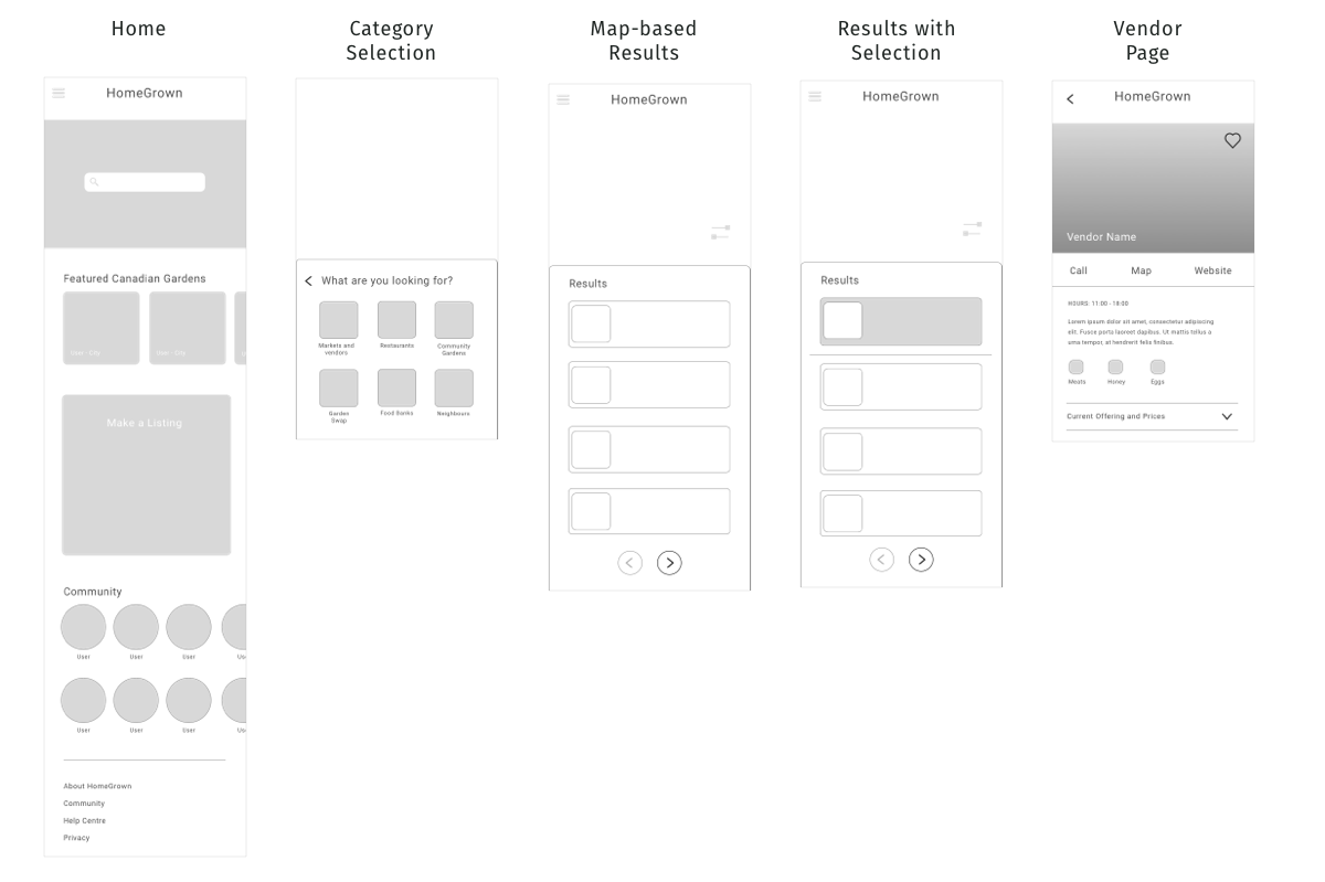
Low Fidelity Wireframes

High Fidelity Wireframes
User Testing
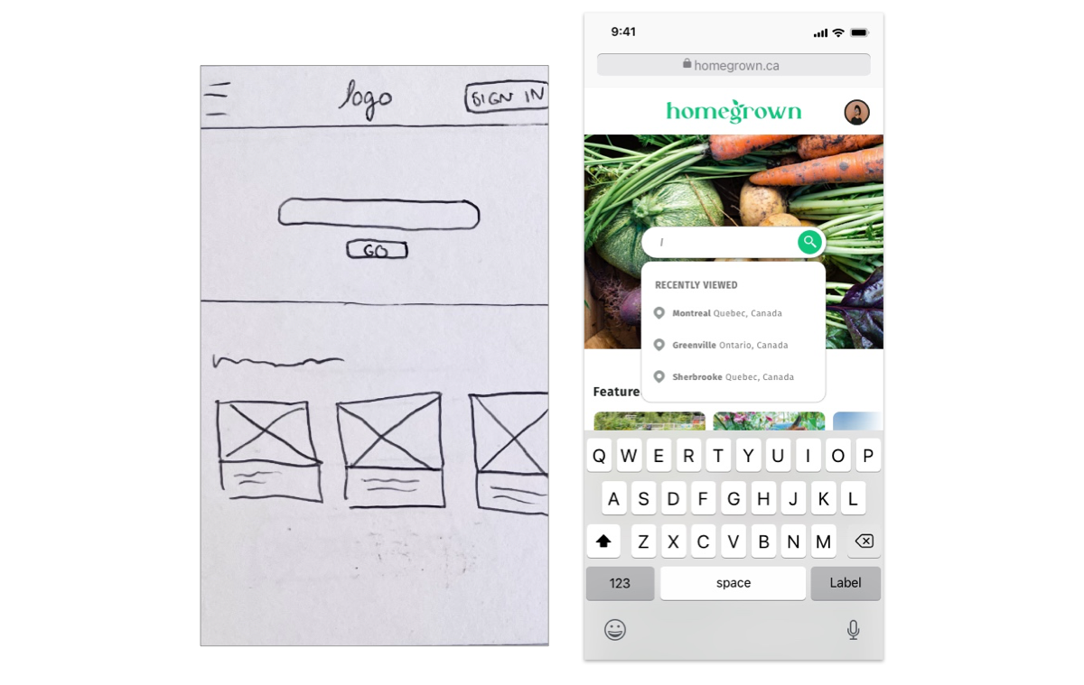
Common Pain Point #1
Participants didn’t know what to type into search bar
Solution
- Include a drop down menu for location (Mobile).
- Larger devices can also have more instruction.
- Include function to search business name in search bar.
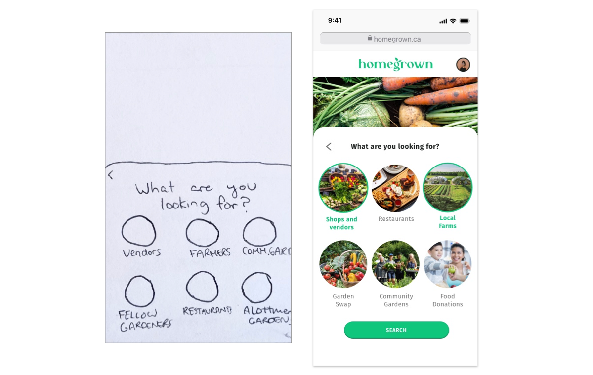
Common Pain Point #2
Confusion about microcopy: “Gardeners”, “Vendors”, etc
Solution
- Discussed different words with participants to determine the clearest terminology
Mobile Screens
Responsive Designs
Reflection
The brief was to develop a location-based web app. I chose to tackle the problem of disconnect between consumer and their food source. Focusing on locally-grown food was an appropriate take on the location-based aspect of the brief.
What I learned
User research, and in particular, user interviews were the most important factors in determining the features of the MVP. I used the findings of this research to develop User Personas that I could always refer back to in order to empathize with the user when making design decisions.
Biggest Challenge
Condensing all my ideas into a simplified MVP was challenging. I considered my research and followed the principles of Lean UX to determine which features were absolutely necessary. I had to reconsider the User Flow when developing the MVP. I was working with a complex problem that needed solving and had many different ideas that needed to be refined.
Insights I gained
The learnings from my User Interviews had the biggest impact on the User Experience. Usability Testing also revealed some significant blindspots in the early stages of wire-framing.
Going Forward
The research was so useful that I would like to have done even more. If time were not as much of a constraint, I would do more rounds of usability testing.