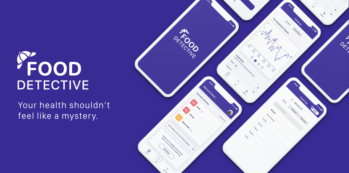
Food Detective is a native mobile app for both iOS and android that tracks correlations between your diet and uncomfortable symptoms related to your overall health.
- My Role: Design Researcher, User Interface Designer
- Timeline: 4 week project
- Tools Used: Figma, Balsamiq, Photoshop
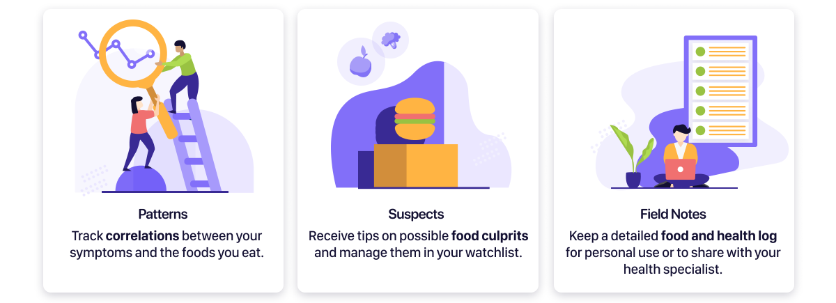
Key Features
Discovery
Defining the Problem
While serious food allergies can be detected with a test, food sensitivities are harder to detect. There is growing recognition in the relationships between gut health and the rest of the body, but people tend to react to foods differently from one another. Nutrition is not a one-size-fits-all.

Exploration
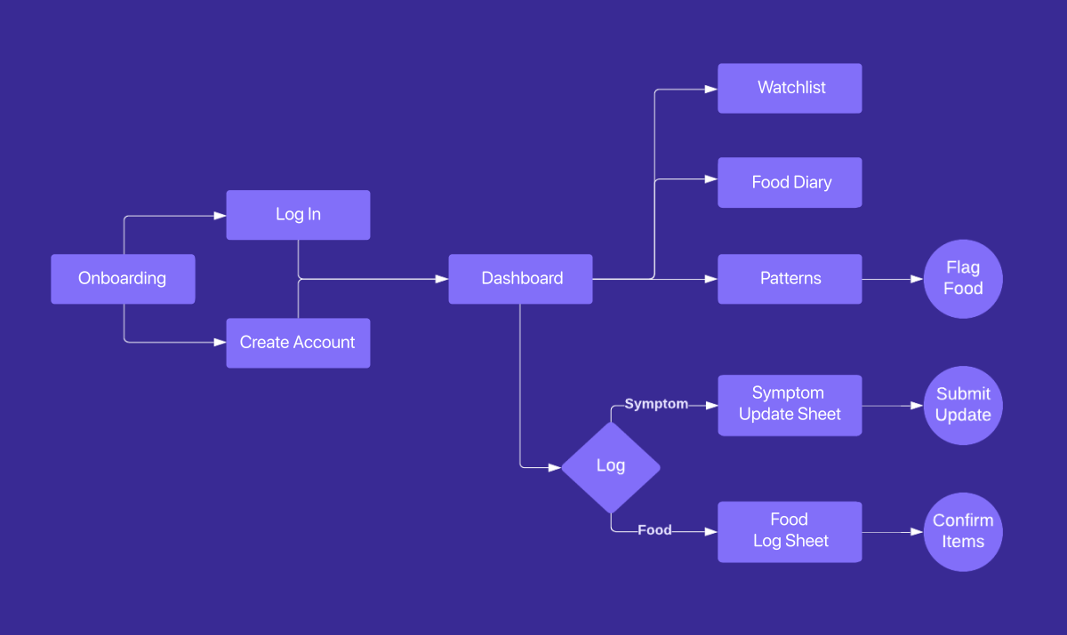
User Flow
Data Visualization
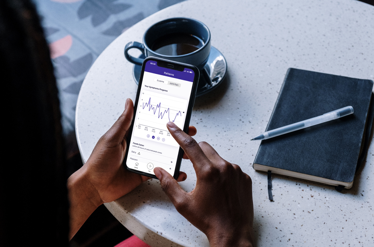
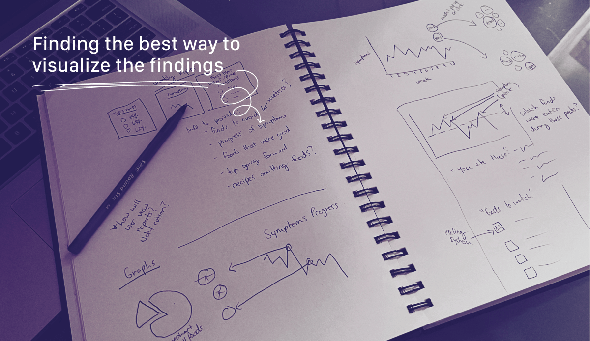
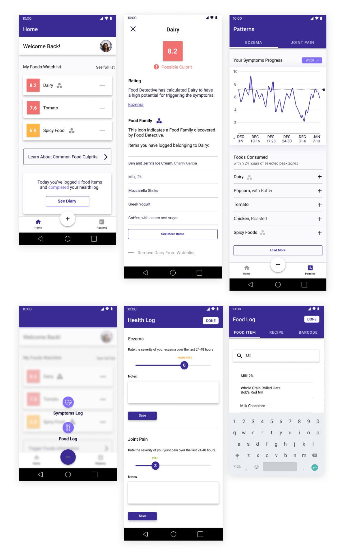
The information discovered is useless if the user cannot quickly and easily read it. I sketched and brainstormed many methods of data visualization, testing each method on participants in between. The final format features a list and rating system on the dashboard to display the most probable food suspects. The Patterns page delves deeper, with an adjustable line graph showing peak symptom periods and the foods recently eaten.
Design
Low Fidelity Wireframes
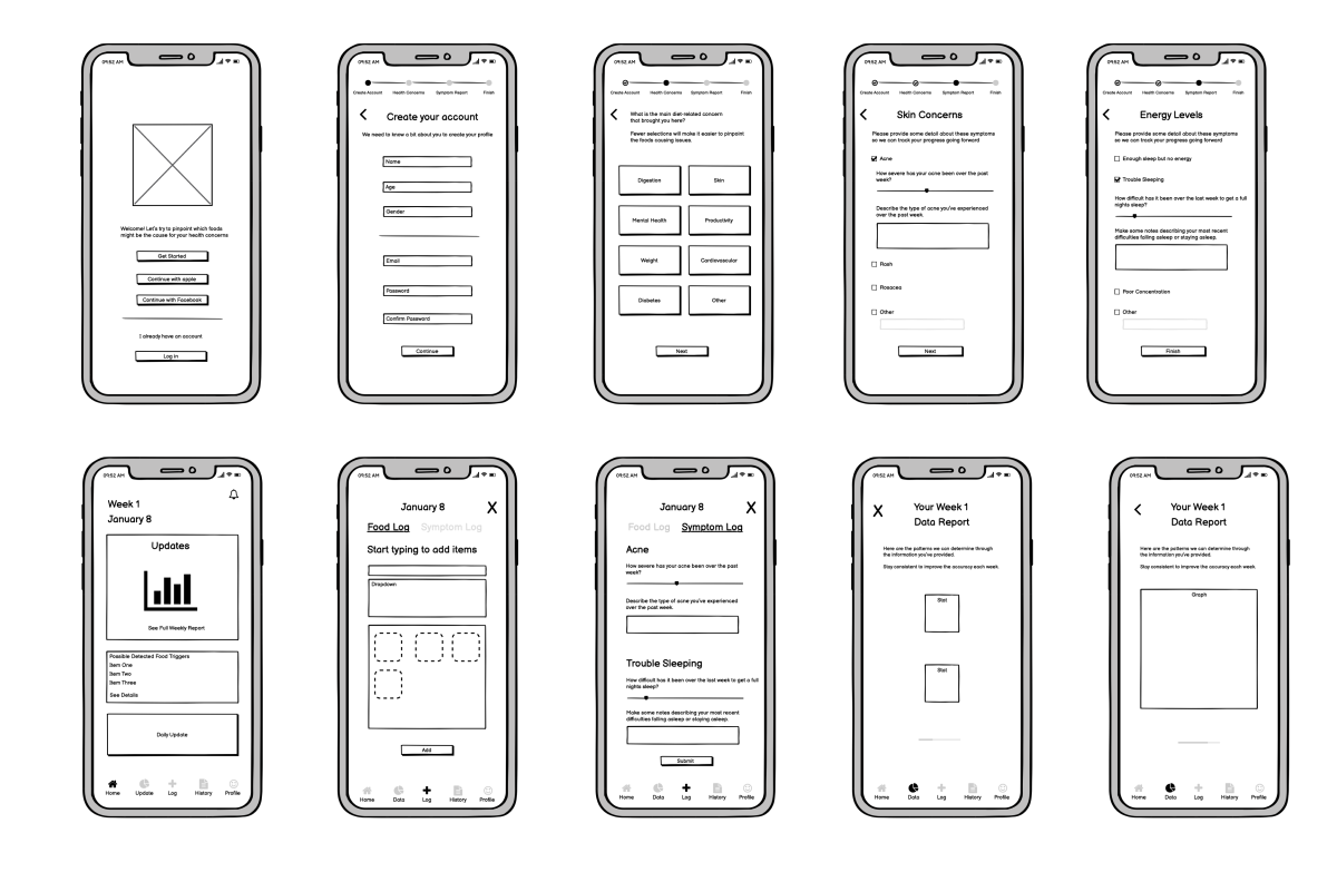
The initial low-fidelity wireframes mapped out key elements of creating a customized health profile and inputting the necessary information for daily logs.
High Fidelity Wireframes
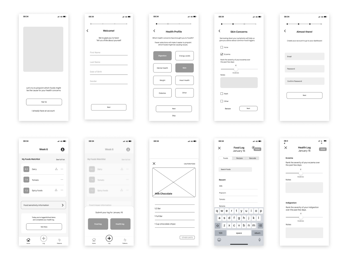
Multiple iterations and user tests resulted in these high-fidelity wireframes.They present more defined dashboard layout, log system, and data visualizations.
User Testing
Pain Points
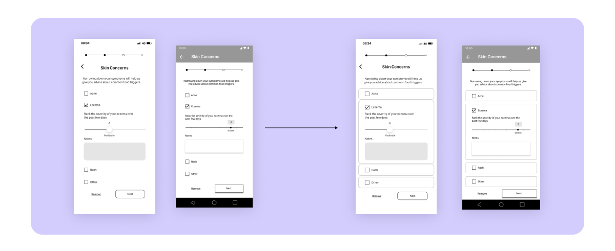
- Lack of distinction between sections leads to confusion in some cases.
- Checkbox is small and the user has to be careful to accurately tap the area.
Solution
Turning each category into an individual section, instead of a list. This creates visual separate and is more clear This also indicates the user can click anywhere in that space, they don’t have to aim to tap the checkbox
Pain Points
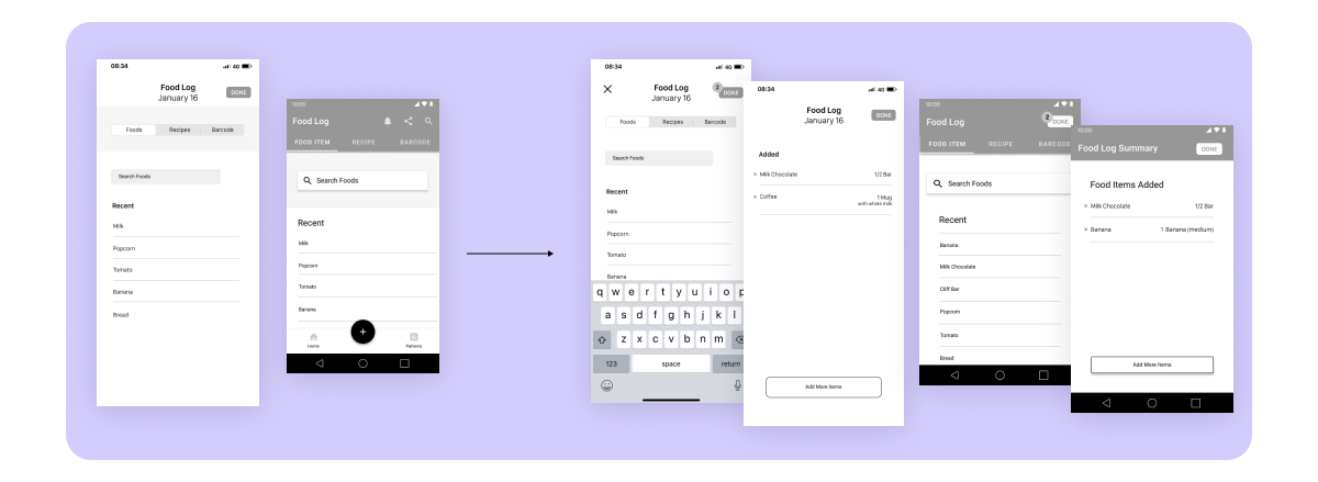
- No strong confirmation that an item was added
- If an error is made, the user has to go back to the home screen to fix it
Solution
- When a food item is added, a number appears over the done button to communicate it worked. There would also be a sound feedback for each item added
- A confirmation page allows the user to make changes
Pain Points
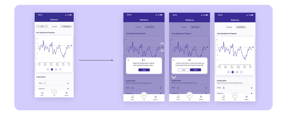
- It isn’t clear enough that the list is linked to the information on the graph. One user thought it was a record of the most recent food logs
Solution
- A short tutorial explaining how to read the information the first time the user enters the page
- Subtitle under “Food Eaten” to provide more context
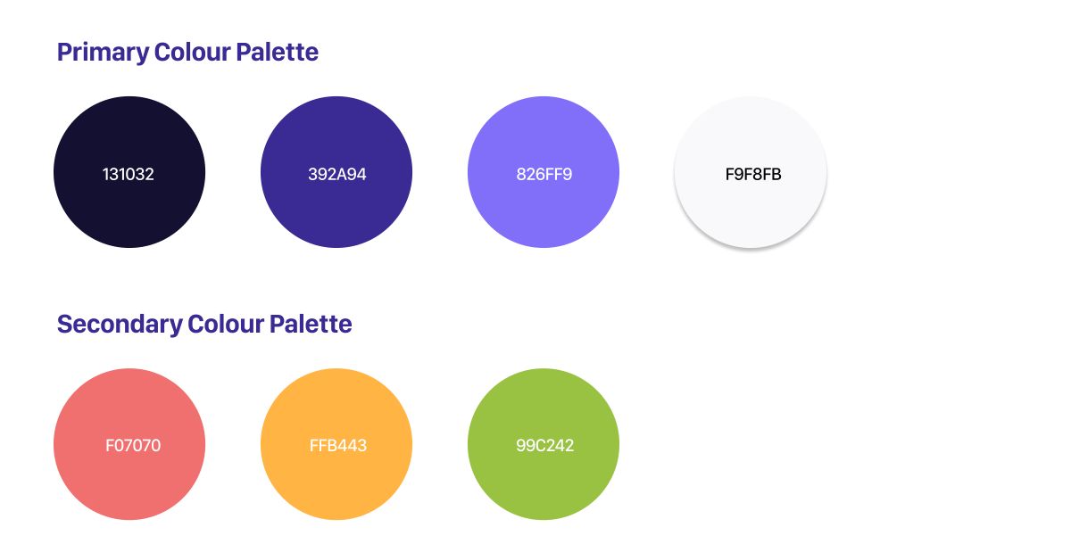
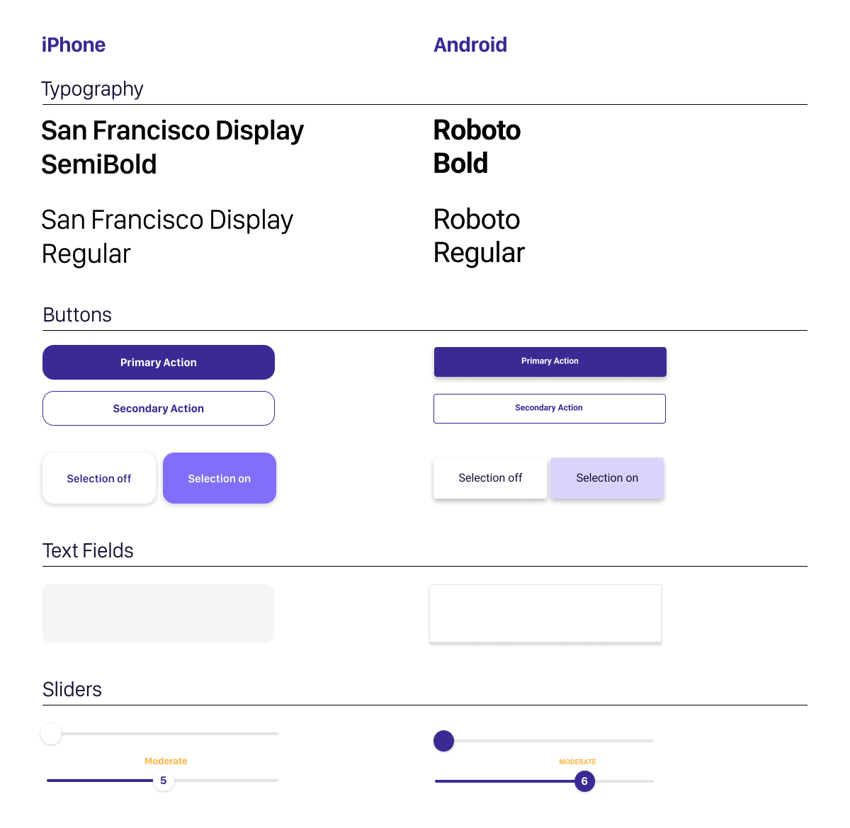
Style Guide
iPhone Final Screens

Android Final Screens
Takeaway
- If designing on a larger team with more resources, it would be very helpful to consult with health professionals at the research stage. This could aid in creating a more tailored experience and asking the user for info regarding allergies and prexisting health conditions.
- As an iPhone user, I spent a lot of time learning the fundamentals of Material design. While I now have a strong understanding of the basics of designing for Android, I would like to continue studying Material Design to gain a more advanced level of knowledge.
- The app has a lot of potential for developing other features. A page for browsing articles related to the user’s symptoms and recipes that omit the indicated food culprits could be a future step to explore.